
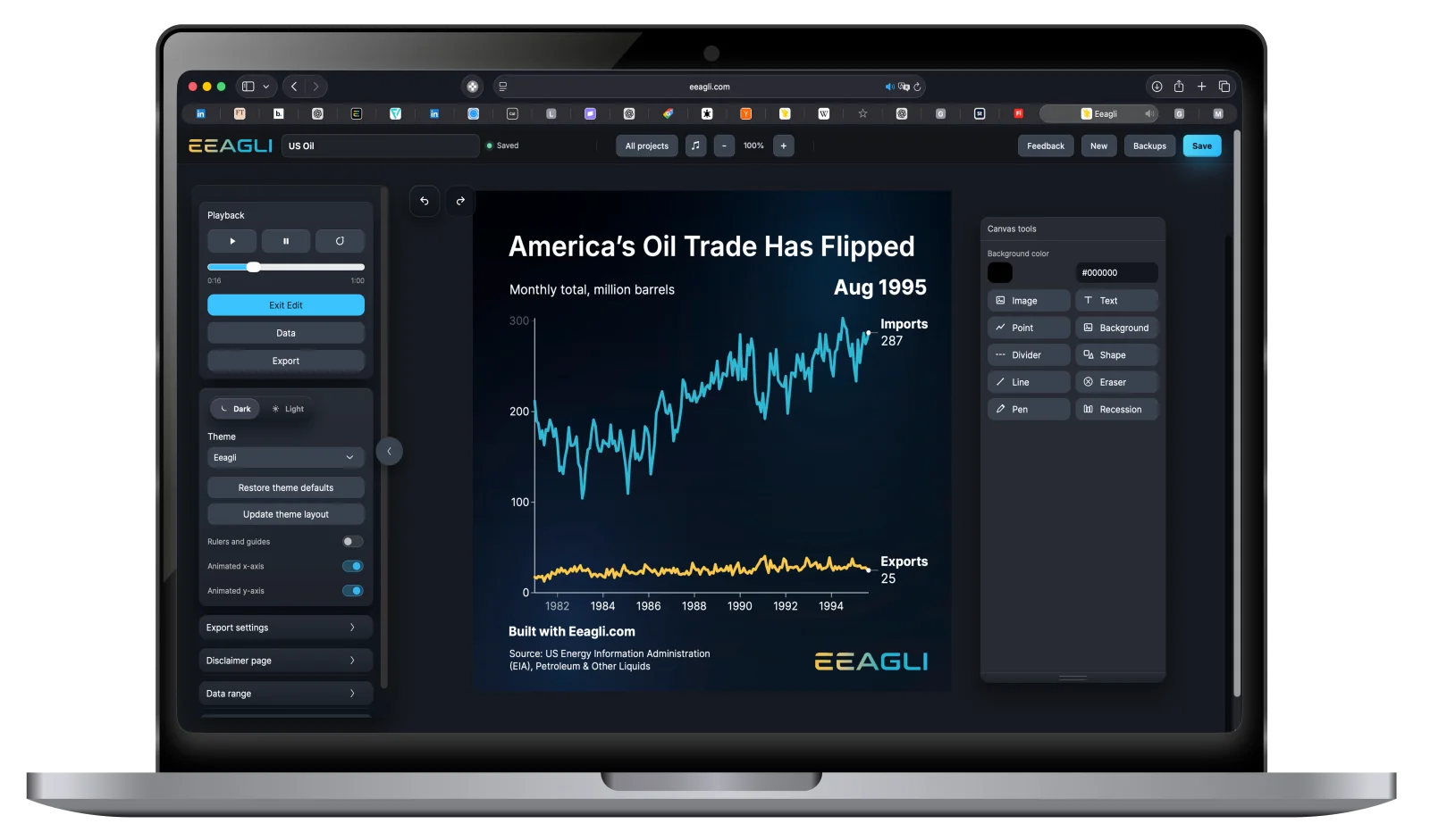
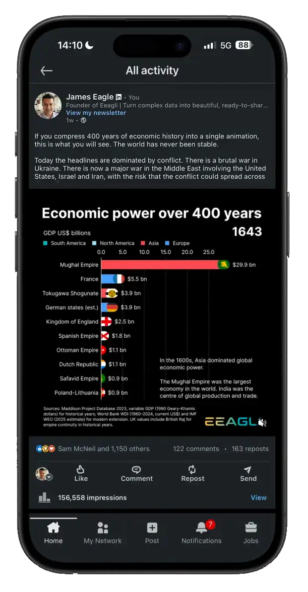
Make charts as good as your ideas.

You can see the story in your data.
Getting people to see it is the hard part.

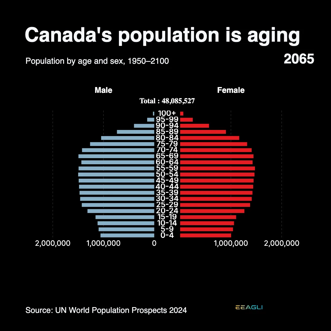
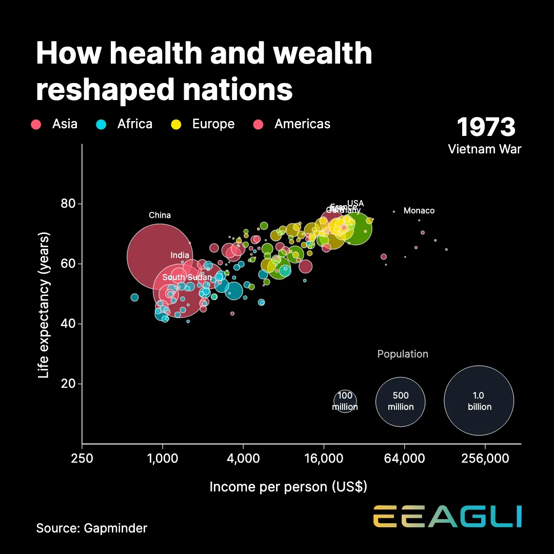
An Eeagli animated life-expectancy chart

The problem

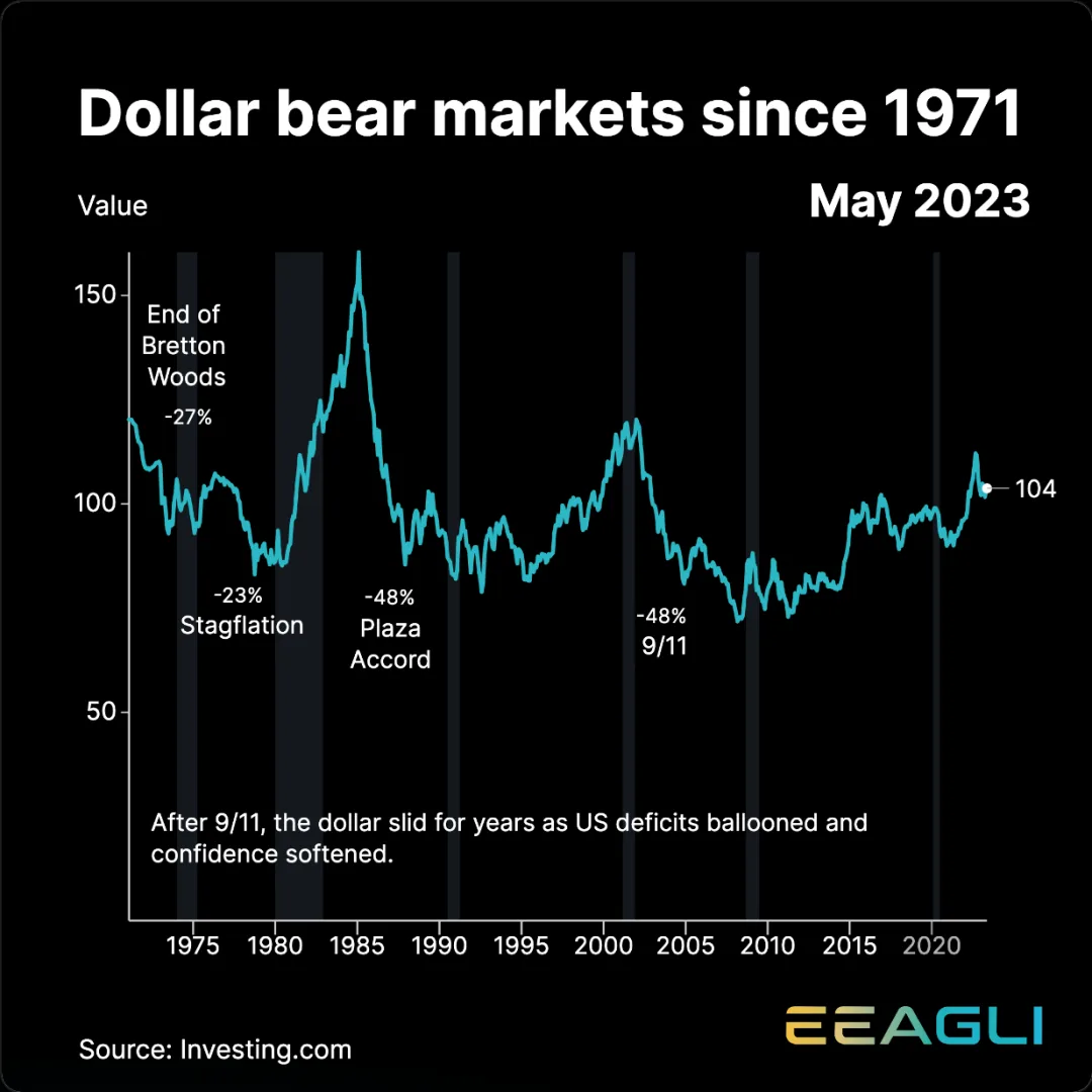
Anyone can make a chart.
Few make one worth watching.

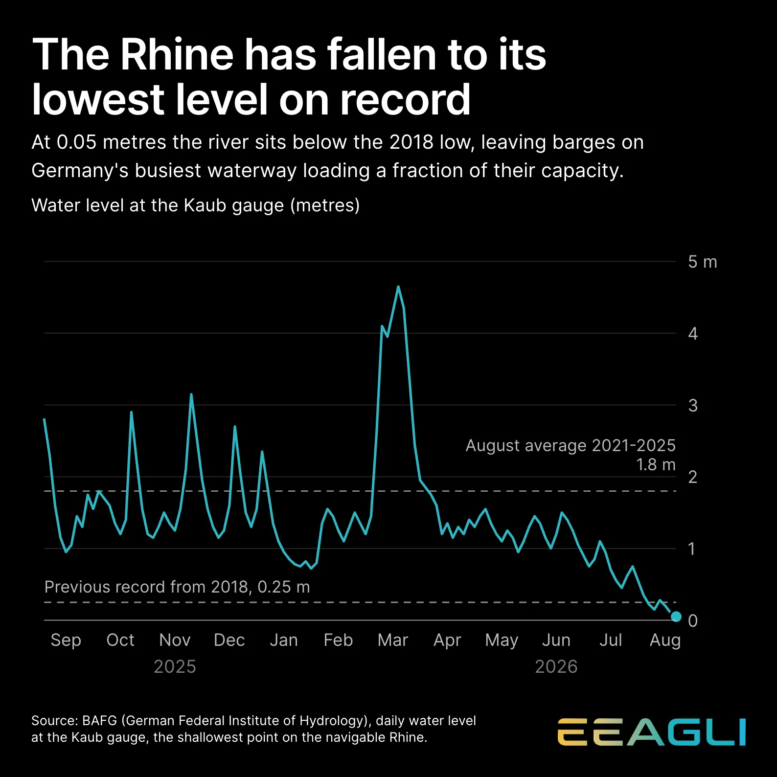
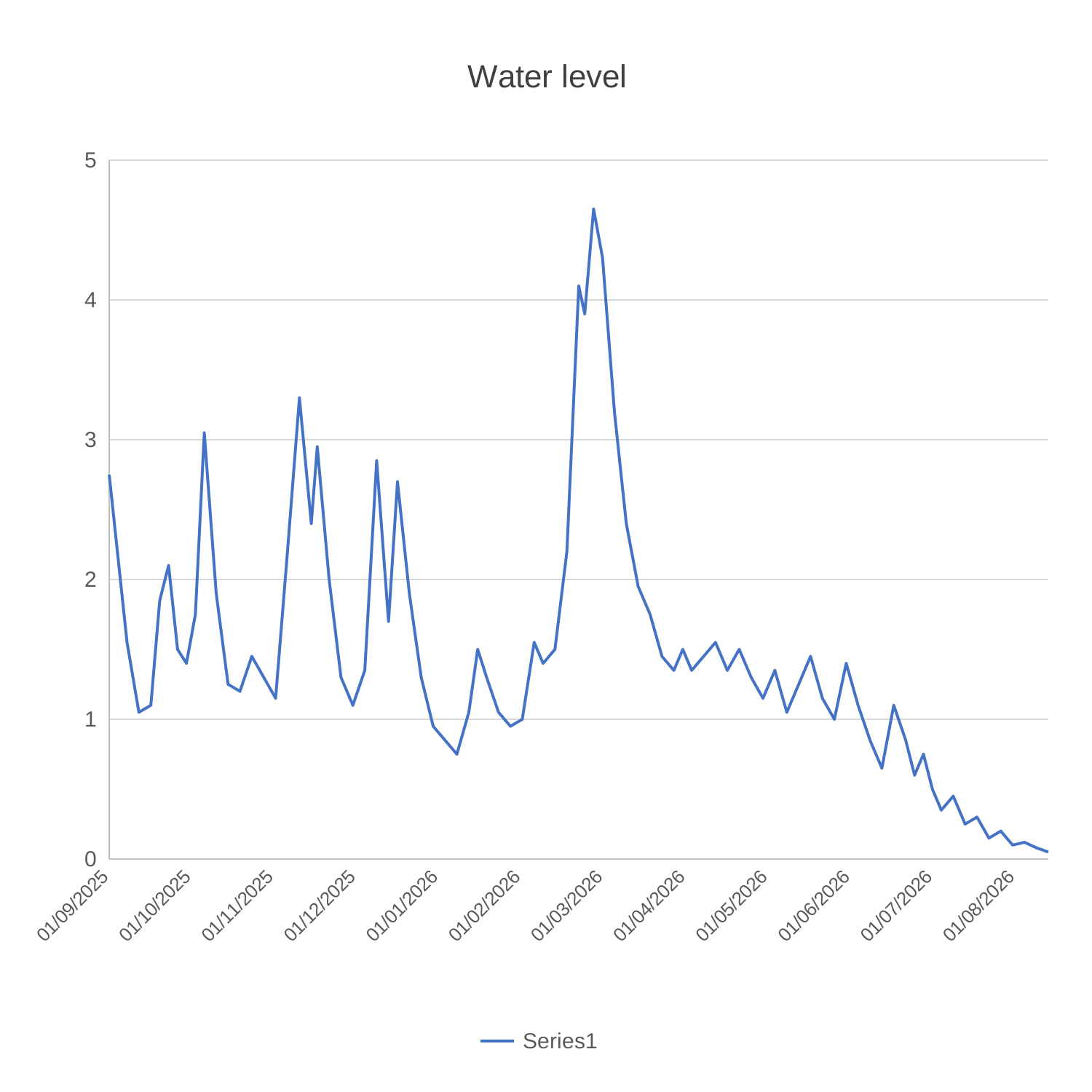
The same data as an Eeagli chart A default spreadsheet chart of Rhine water levels
BeforeAfter
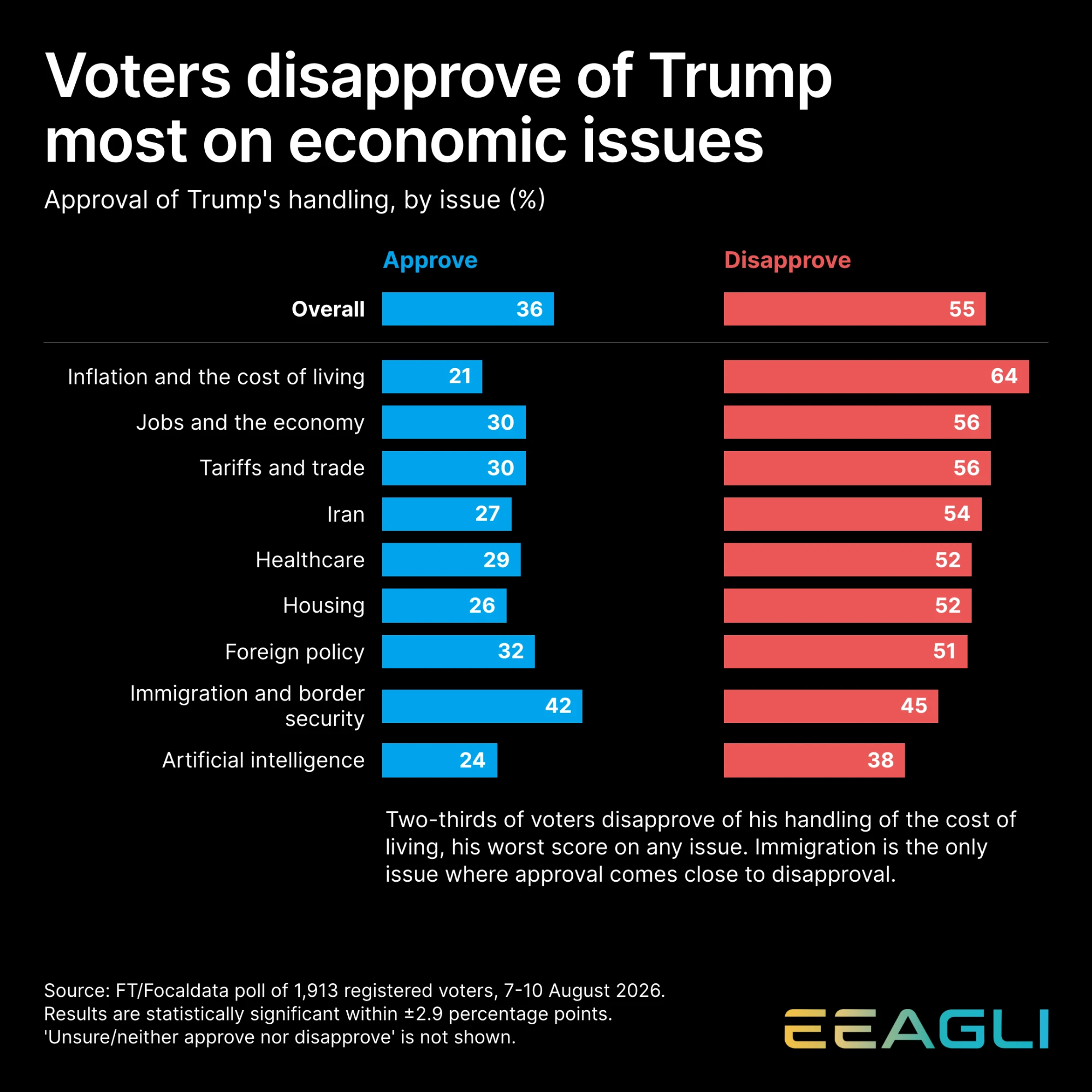
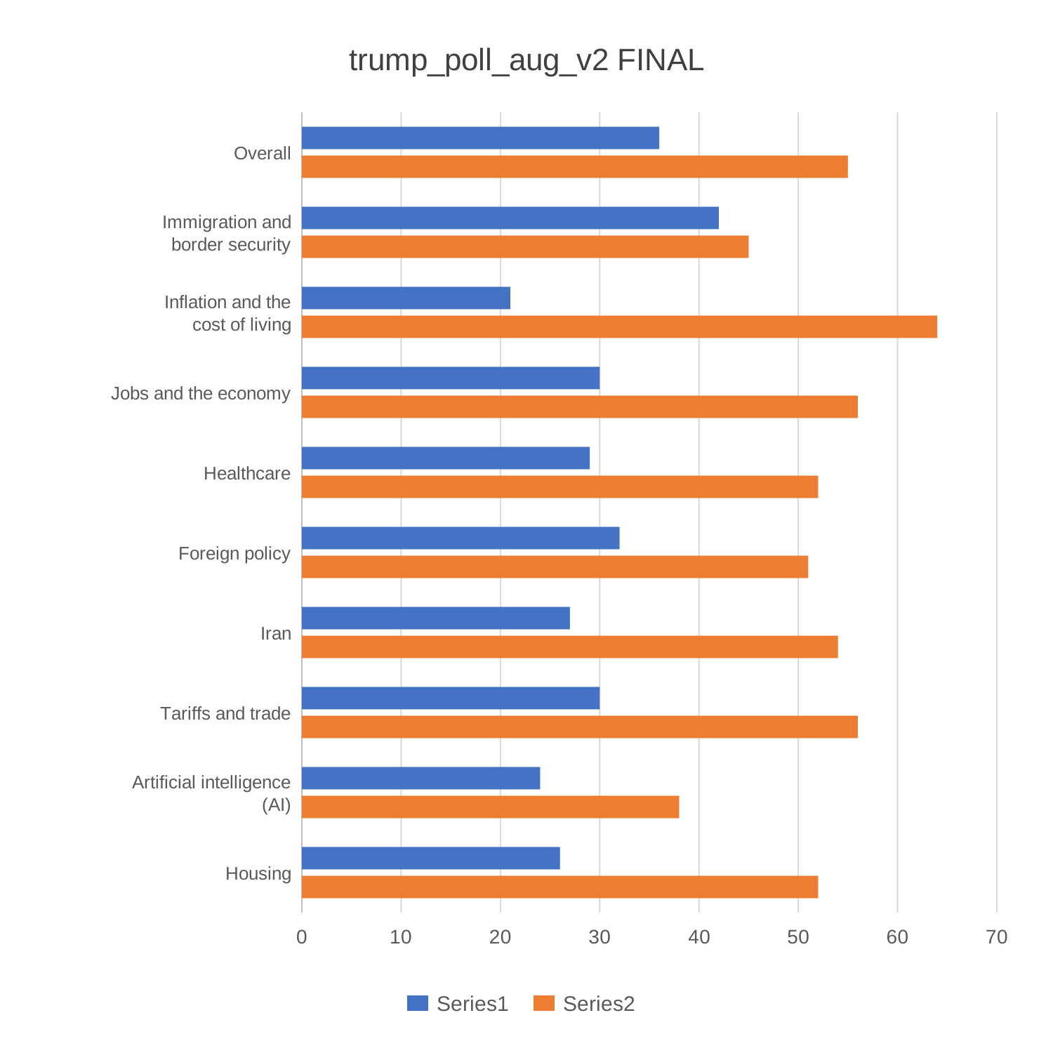
The same data as an Eeagli chart A default spreadsheet chart of approval polling
BeforeAfter

Good data is hard to show

Complex thinking is hard to visualise. A good chart makes it look effortless.

AI alone is not the fix

Even with the latest tools and AI, a chart can still come out looking mediocre.

Rules bury the message

Added too late, brand rules and disclaimers eat time and hide the point of the chart.

The solution

Fix the workflow.

A smooth workflow makes charts effortless to create.

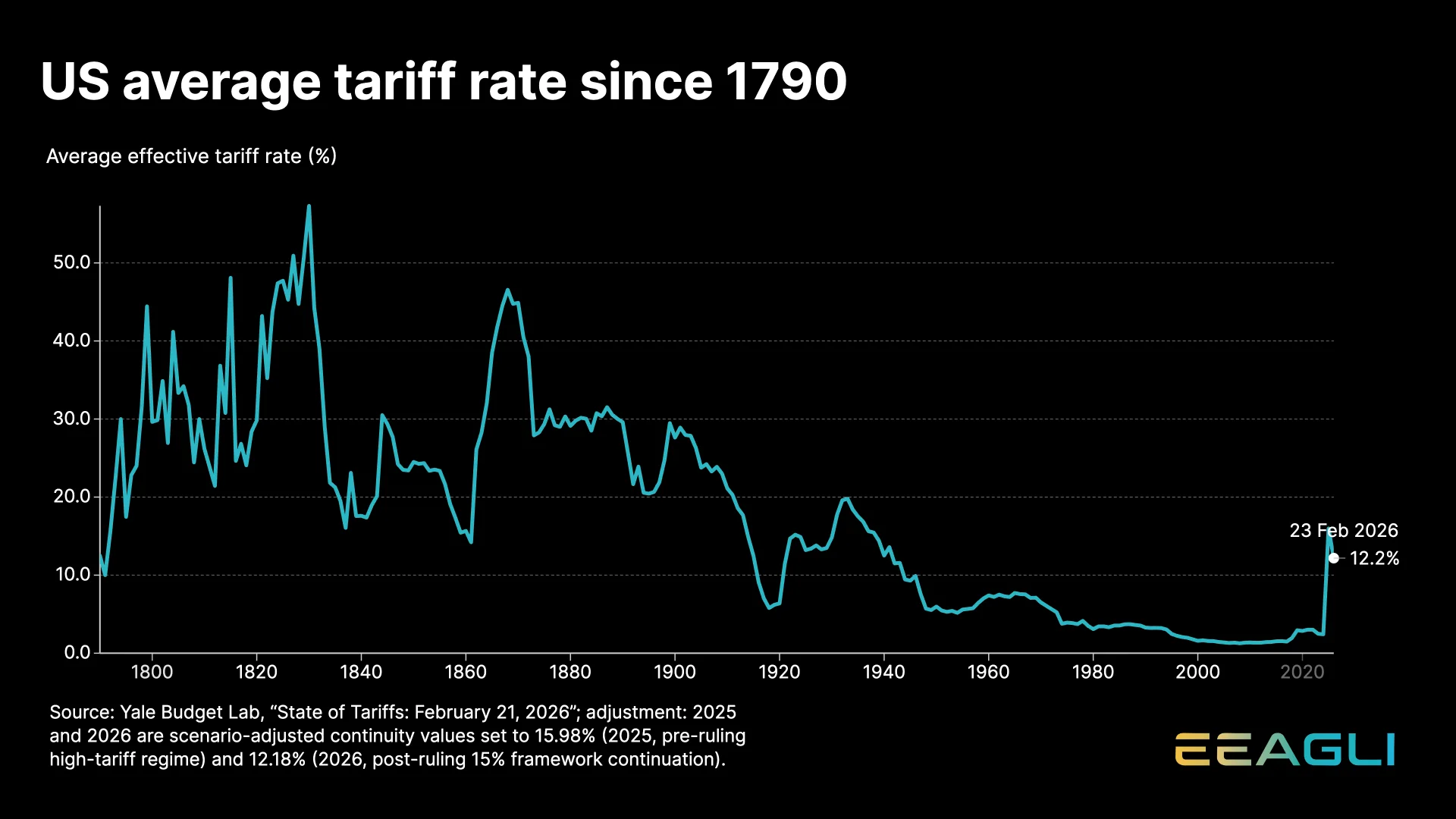
tariff-rate.csv · 236 rows, 2 columns
Year
1790
1800
1810
1820
1830
1840
1850
1860
1870
1880
1890
Rate (%)
10.0
30.0
21.1
29.4
57.3
17.2
24.5
15.7
44.9
29.1
29.6
Detected
Column 1Year → time axis
Column 2Rate (%) → value
SuggestedAnnotated line
Ready to chart

The result

Build once. Publish everywhere.

Remaking the same chart for a slide, a phone and a web page is where the hours go. Build it once and Eeagli reshapes it for each.

Presentations

New numbers, same slide. Export widescreen at 4K and drop it in.

Social media

Vertical or square, with the dead zones drawn on screen so nothing covers your data.

Web

Interactive charts on your own site, like the Financial Times or the New York Times.

A good chart used to cost half a day. Now it takes half an hour or less.
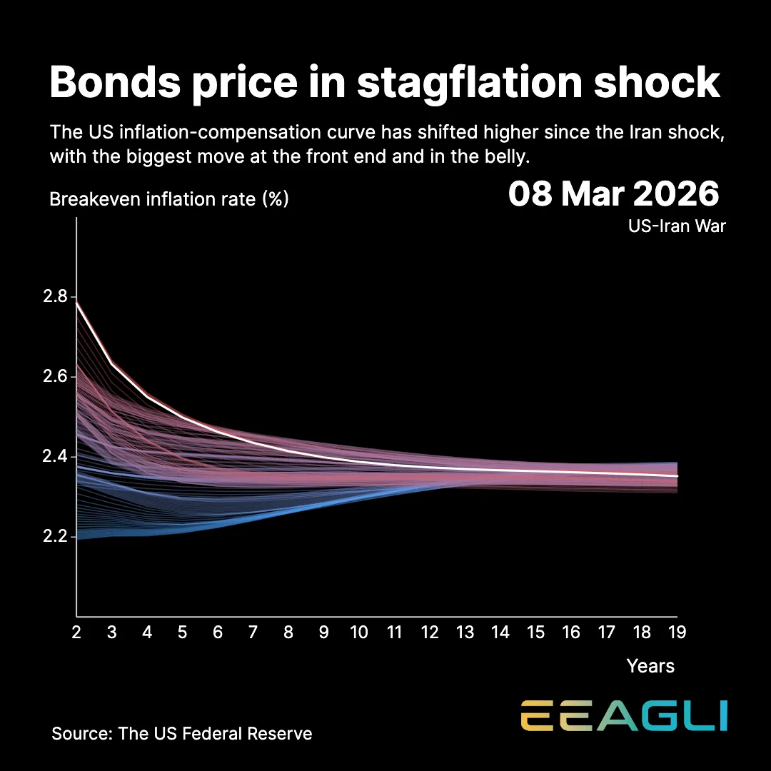
Chart types

There’s a chart type for every story.

From a simple line to a yield curve, Eeagli handles the charts professionals publish.

One plan, billed monthly or annually

Can I use my own data?

Yes. Paste it in, or upload a CSV or Excel file.

Do I need a designer?

No. Set your brand up once and every chart inherits it.

What does the plan include?

The full studio, free still exports and 30 publishing credits a month.